Introduction and examples

Author

Joshua Loftus

Published

September 26, 2022

Summary

We begin by considering examples within two broad themes: the replication crisis in science and fairness and inequality in algorithmic or data-driven systems.

References

Assigned reading

Additional references

Replication crisis

(Un)fair algorithms

Computer setup

Installing R and RStudio

First install R and then install RStudio (this second step is highly recommended but not required, if you prefer another IDE and you’re sure you know what you’re doing). Finally, open RStudio and install the tidyverse set of packages by running the command

install.packages("tidyverse")

Note: If you use a Mac or Linux-based computer you may want to install these using a package manager instead of downloading them from the websites linked above. Personally, on a Mac computer I use Homebrew (the link has instructions for how to install it) to install R and RStudio.

Resources for learning R

Notes

We discussed Figure 1 from The significance filter, the winner’s curse and the need to shrink and whether the file-drawer effect helps to explain it.

Simulating many hypothesis tests

We created a simple simulation to understand how this might happen.

library(ggplot2)
library(dplyr)
theme_set(theme_minimal())
set.seed(1) # for reproducibility

# Generate the simulated world
N <- 5e4 # total hypotheses tested
proportion_null <- .4
signif_level <- qnorm(.975)
is_null <- rbinom(N, 1, proportion_null)
effect_size_nonnull <- .5
simulated_world <- data.frame(is_null) |>
  mutate(
    zscore = rnorm(N, 
                   mean = (1 - is_null) * effect_size_nonnull,
                   sd = 1 + .1 * (1 - is_null)))
head(simulated_world)
  is_null      zscore
1       0  0.71621827
2       0  0.03806304
3       0  1.77959649
4       1 -0.40575597
5       0  1.31850857
6       1  0.47661057

This creates zscores with mean = 0 and sd = 1 under the null and larger mean and sd values when is_null is false.

Observed effect sizes when proportion 0.4 are null

simulated_world |>
  ggplot(aes(x = zscore, fill = factor(is_null))) +
  geom_density(alpha = .5) +
  geom_vline(xintercept = c(-1, 1) * signif_level,
             linetype = "dotted") +
  scale_fill_viridis_d(option = "magma")

Simulating publication bias

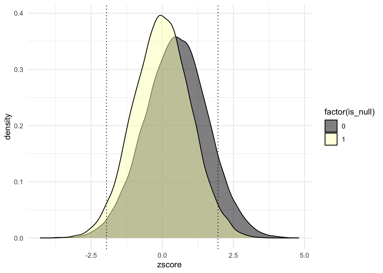
But analysts don’t know which hypotheses are null, so they could not create this plot or separate the zscore values into the null and nonnull cases. Instead, some analysts may choose to only publish the results that seem significant.
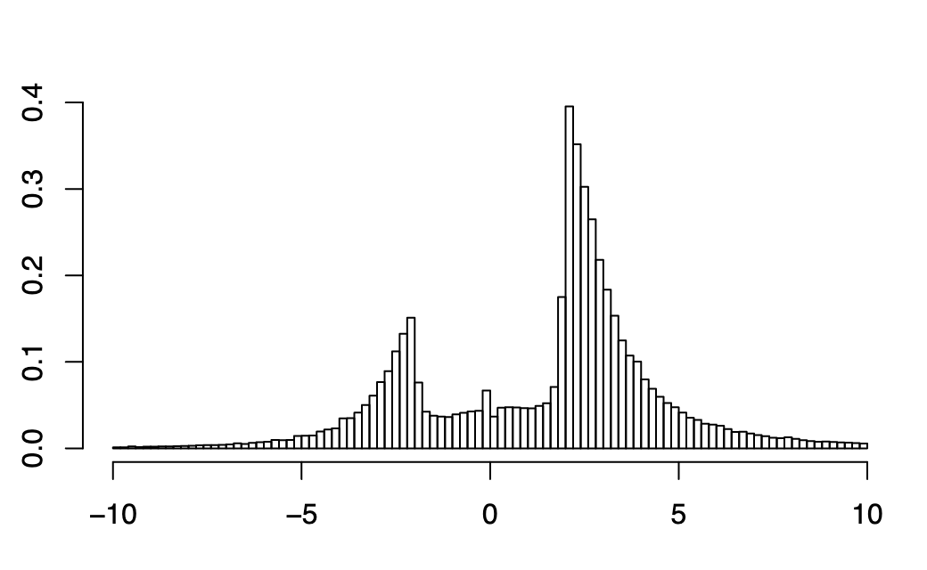
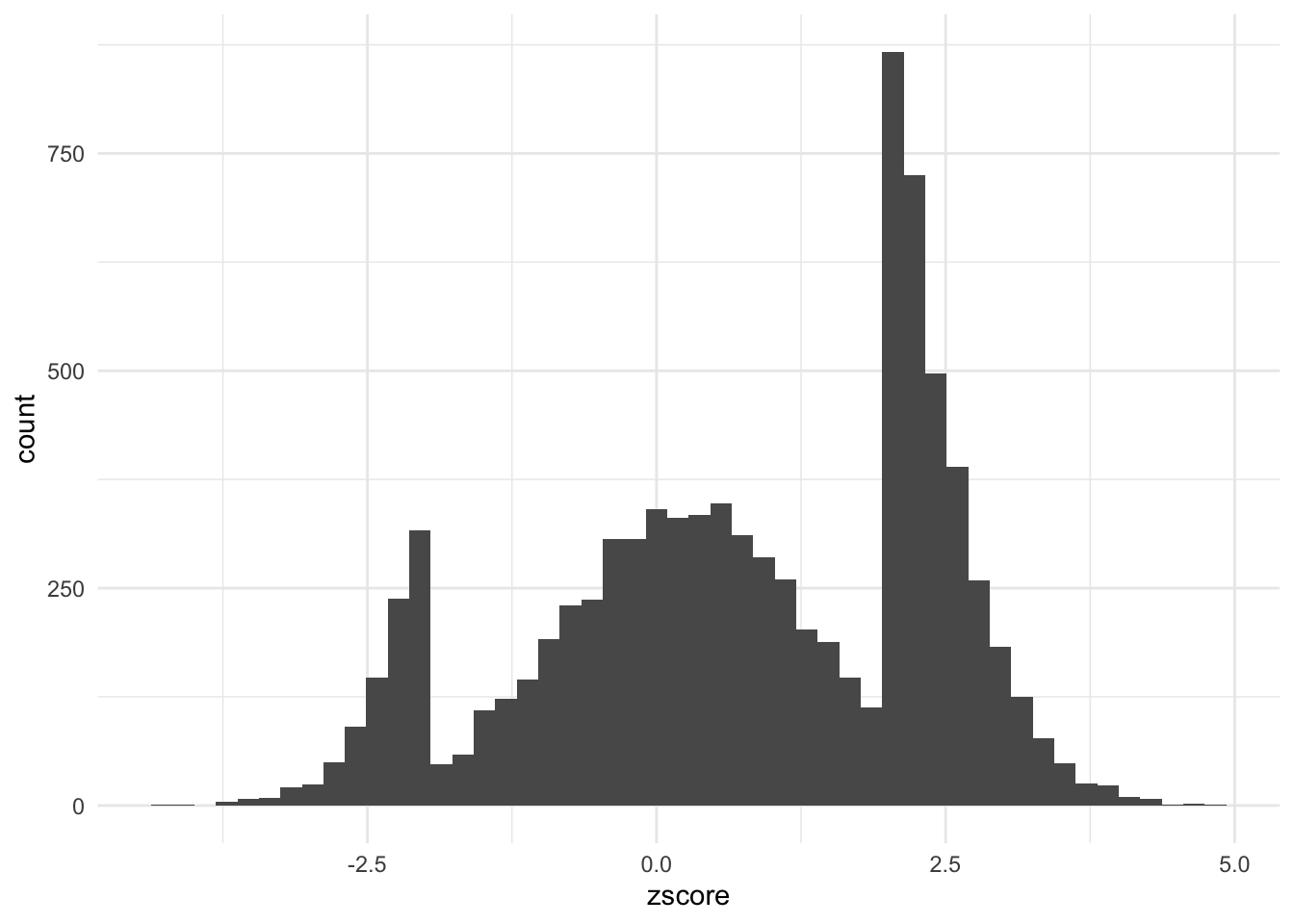
# Generate simulated published effects
proportion_phack <- .9
which_studies_phacked <- rbinom(N, 1, proportion_phack)
simulated_publications <-
  simulated_world |>
  mutate(phacked = which_studies_phacked) |>
  dplyr::filter(phacked == 0 | # not p-hacked OR
                abs(zscore) > signif_level) # large enough
nrow(simulated_publications)
[1] 8768

Published zscores when proportion 0.9 are p-hacked

simulated_publications |>
  ggplot(aes(zscore)) +
  geom_histogram(bins = 50)